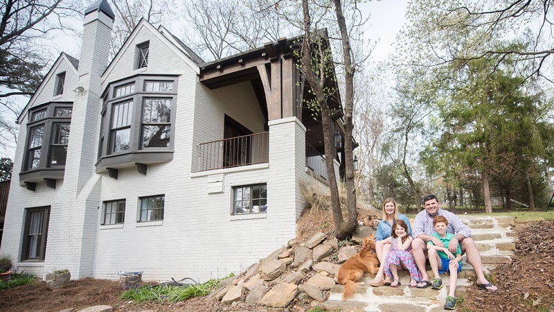
One weekend—that’s the extent of the time Eva and Marco Gonzalez had to find a house before they moved to Birmingham from Baton Rouge. When they drove down Redfern to a 1935 Tudor set back on two lots, their eyes lit up. “The bay windows instantly attracted us,” Eva recalls. “Being from Baton Rouge everything was really flat. We wanted a Birmingham looking house,” Marco adds. And it doesn’t get more Birmingham than their sloped lot encased with stone walls so distinct that that’s how many Homewood runners and bikers know it. The couple put in an offer after just one look.
That was 2002. Thirteen years, two kids and one golden retriever rescue later, the Gonzalezes still loved the character of the home, but they also were craving some changes too. Like everyone in Homewood, they wanted new bathrooms and more closet space, as well as a renovated kitchen and space for their kids, now ages 8 and 10, to grow into. “We truly loved the original house. We just wanted it to work for us and for our busy family,” Eva says.
To do so, they enlisted a team that values historic homes just as they do, with Jared Bussey, a longtime friend, working on the architectural design, and Jama and Geoffrey Ketcham on the construction. And so when the Gonzalezes said they wanted to keep most of the original windows—even though they are not energy efficient—their team was on board too. That attitude carried over into lots of innovative ideas too.
As construction began, doors were removed, but most were just relocated to other spaces with their original hardware. The stone pathway was pulled up and then re-laid with the original stones. The original front door became a sliding door over the kitchen pantry. Wherever possible, bricks that were removed were put back in new spots that needed covering. “In everything we did we wanted it to look old, other than the kitchen,” Eva says. “I wanted it to be bright and shiny.”
Perhaps the most notable change in the house’s journey from 2,200 square feet to 3,200 was the addition of a new story on top, although it’s not visible from the street. Where the house once ended in the back you’ll now find a staircase leading to a third story with kids’ rooms and a laundry room—home to some of many new sets of storage spaces now in the house. “We have always lived in an old house, so it’s been nice to have a place to put your stuff,” Eva says.
Downstairs, the master bedroom remained the same and a nursery became a guest room, but the bedroom in between the two was used to make a large master closet and bathroom. “Jared figured a way to get us everything we wanted,” Eva says.
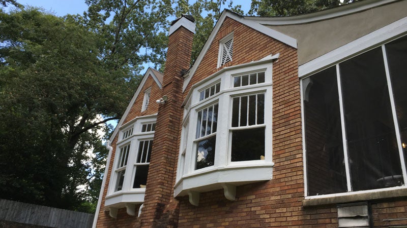 Outside, the original orange hue brick was painted white, and on the front porch screens were removed, the roofline was reworked and the front door was moved to open in an entry space with the large bay windows that had originally sold them on the house instead of straight into the living room. In its place, though, the windows were selected to fit the historic character of the house of course.
Although the home’s exterior is lighter and there’s extra square footage hidden from the road, it’s still the same 1935 Tudor— stand-out bay windows, rock walls and all—that the Gonzalezes have treasured for 15 years and counting.
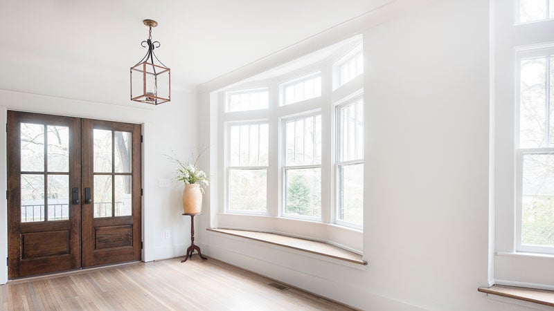 Entryway
Two large bay windows on the side of the house were originally a major selling factor for the Gonzalezes. With the renovation, they moved their front door from opening to the living room to this entry area that better shows off the windows.
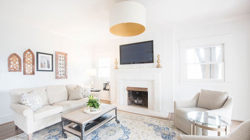 Living Room
Most of this room structurally remained the same, but now a single neutral wall color—a custom mix Jama Ketcham dubbed “Gonzalez grey”—ties all it together with all the other rooms in the house. “Sometimes it looks white, sometimes it looks grey,” Eva says. “I wanted a really clean palette.”
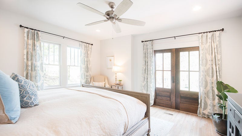 Master Bedroom
Most of the master bedroom remained the same in the renovations, except that they replaced a window and window seat with French doors that open up to the front porch.
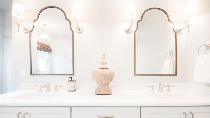 Master Bathroom
For years the Gonzalezes “rotated” their closet contents seasonally, but no more. Where a bedroom and small bathroom once stood they created a new large master closet as well as a bathroom with a soaking tub and a shower.
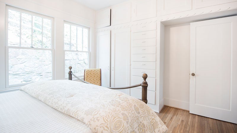 Guest Bedroom
What had served as a nursery for years is now the house’s guest room. The room still has the original built-in drawers and other signs of its 1935 character.
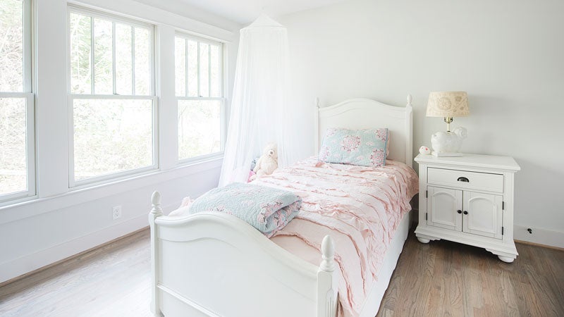
Girl’s Room
Eva found most of her home’s bedding from Pottery Barn, including this light pink ruffled bed set and quilt for her daughter’s room. It shares a Jack N Jill bathroom with her brother’s room.
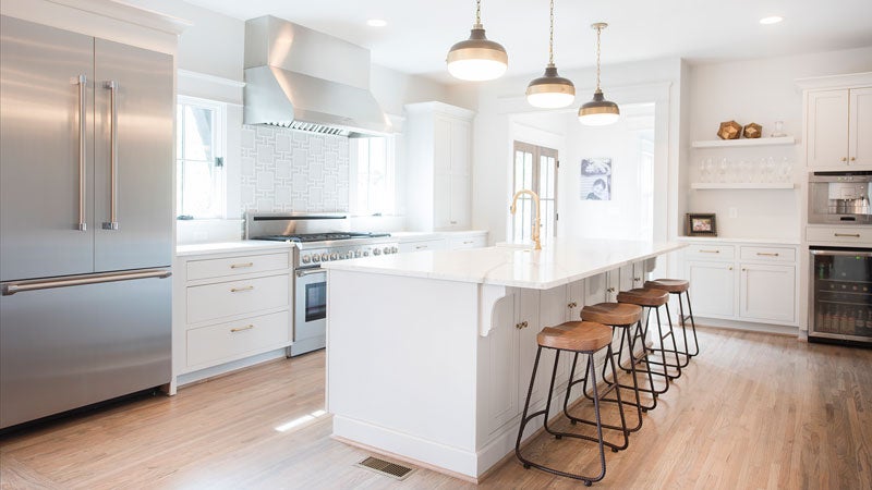
Kitchen
Eva wanted a giant island, and a giant one she got with this piece of crema Delicato honed marble—a stone she picked because it had “a lot of movement and a lot of grey.” The island also provides the extensive storage space she envisioned. Adjacent to it is a beverage bar with a built-in coffee/espresso maker and a beverage refrigerator.
Above the “massive” stove Eva picked out is a glass and marble geometric backsplash (Bryant Square Petite Blend) that she says appealed to her as an engineer. Large drawers in lower cabinets hold dishes, and Feiss lights above the island add a nautical flair.
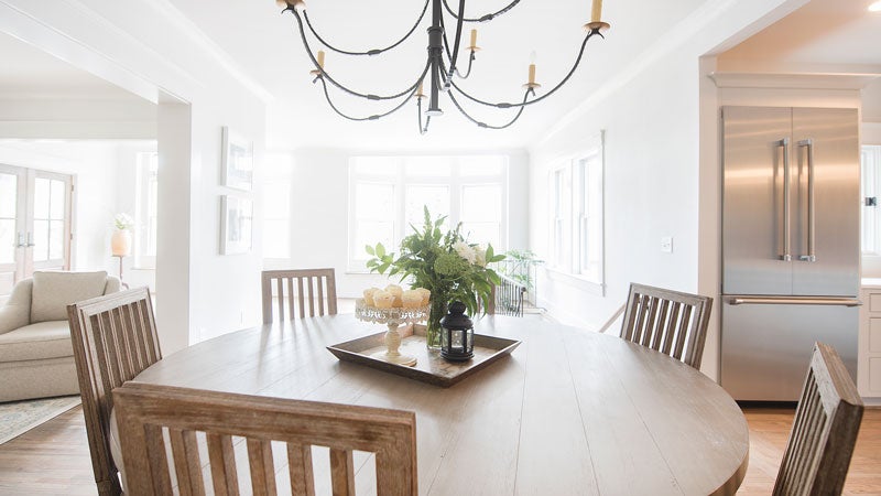 Dining Room
Eva and Marco frequently visited New Orleans when they lived in Louisiana, so they wanted to bring a piece of the Crescent City to Homewood with this custom fixture from Bevolo. The family likes how their round dining table is casual enough for everyday use but can also be dressed up for special occasions.
Meet the Team
- Architect: Jared Bussey, Architectural Cooperative
- Contractor: Jama & Geoffrey Ketcham, Ketcham & Company
- Countertops: Triton Stone Group
- Appliances: Thermador
- Plumbing Fixtures: Ferguson
- Select Lighting: Bevolo, New Orleans
- Cabinet Hardware: Brandino Brass
- Selected Furnishings: Restoration Hardware, At Home, Barnett Antiques
- Bedding: Pottery Barn

