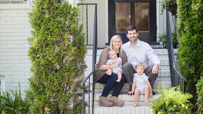
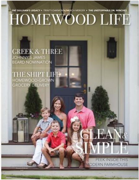
The tale of the McGarrah house is a bit like Goldilocks and the Three Bears. Kristen and Chandler started in a tiny Homewood cottage that quickly got too small as their family grew. Next, they bought a large home just before their third child was born, but it ended up being too big and not having enough outdoor space. “We wanted something cozier,” Kristen says. “I had been excited to move into that big house after a tiny little Homewood cottage, but it didn’t take us long to realize it really wasn’t us.”
So they found a run-down one-story house with a deep lot and large backyard they loved, knocked it down to the foundation and started dreaming. They’d had a home too small and a home too big, and now it was time to build one that was just right.
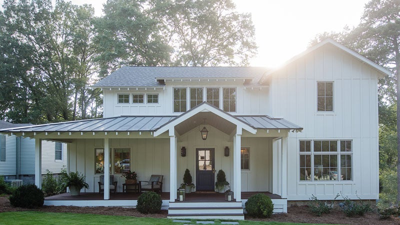
The design process started with the exterior. Kristen wanted it to have a modern farmhouse look with contemporary touches, and she wanted a white house with a traditional front porch. What they came up with was consistent board and batten siding with metal roof on the porch—all giving it a clean and simple style. The windows on the front and back also provide the natural light they wanted in the home while allowing them to limit the number of windows on the sides to maintain privacy. The stone from the original house remains on the exterior and was just cleaned up in the construction process.
Because they were working on an existing footprint, the design process was a long one of give and take. The McGarrahs forewent a bathtub in the master so Kristen and Chandler could have separate walk-in closets. The laundry room got redrawn a bit smaller to make room for an office for Chandler when he works from home. “I was pretty particular because I feel like we will be here forever, so it was a design long process,” Kristen admits.
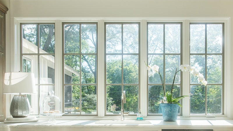 What the family wanted most was an open kitchen and living space, and that’s just what they got, with the living room opening up to a large screened-in porch that acts like a second living room. Kristen got the “wall of windows” she wanted in the kitchen that overlooks the backyard so she can watch their kids play, as well as a wrap-around staircase she envisioned. The hardwoods are a custom stain that matches what Kristen had in mind—a color that would hide dirt.
Laurie Fulkerson of Twin Interiors says Kristen had a good vision for the house that guided their decisions about decor. “She has a lot of upper end finishes, but it feels very comfortable,” Laurie says. “I love her style.”
Walking around the house, Kristen is happy to show off all of her closets—a feature she wanted to be sure the house had knowing she had three kids (now ages 4, 6 and 7). Between the closets and her basement (along with the living spaces of course), the deal is sealed. This one’s just right. “It’s not too big, it’s not too small, and I have enough storage,” Kristen says.
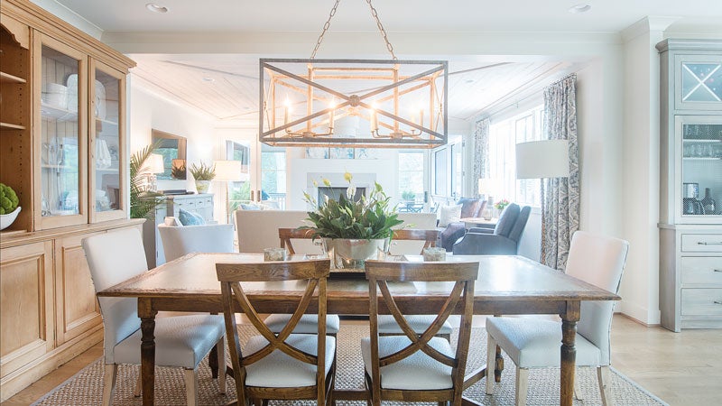 Dining Room
The focal point of the dining room is the large wall cabinet Chandler’s parents had in storage for years. “People think I designed around it, and I should have,” Kristen says. “It just happened to fit, and we were so excited. It holds so much stuff, and I have it crammed full.”
 Kitchen
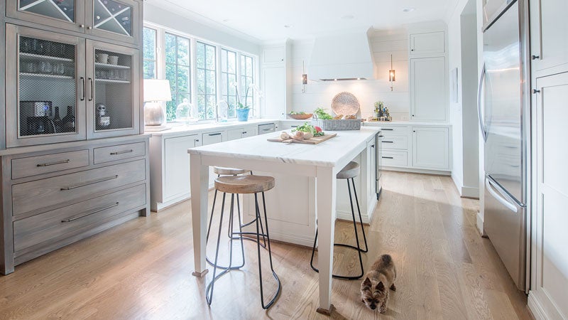
This space directly off of the open living area displays the more transitional than traditional elements Kristen had in mind, with hardy board on the wall and a gas range with griddle that makes clean-up from cooking grilled cheese a breeze. A friend who is designer in Atlanta suggested the idea of a coffee bar to Kristen, and with the help of a cabinet designer, they created a piece that hides her coffee maker, can transition into a bar for entertaining, and provides a storage drawer for her kids’ art supplies. Its contrasting grey color matches the window sashes in the main living areas of the house.
 Screened-In Porch
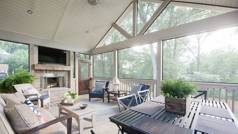
One of Kristen’s primary focuses in designing the house was a large porch that had room for a table to eat at and a sitting area. A large contemporary fan makes it a good escape space for Kristen to drink coffee while her kids watch cartoons in the mornings, and the fireplace extends their porch season into winter. The beam on the fireplace is reclaimed from a previous home owned by Chandler’s dad.
Living Room
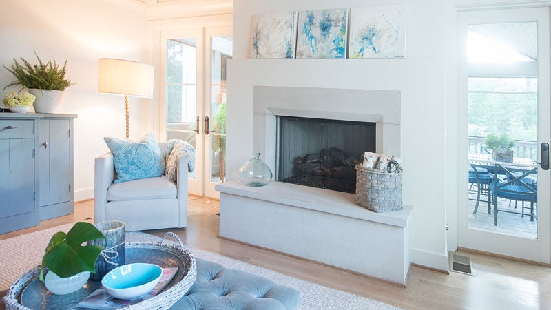
This open space is where the McGarrahs spend most of their time. There wasn’t space for a pitched ceiling, so they had a custom pine design added to create visual interest in the room. Chandler’s father made the console under the TV as house-warming gift for them. Above the mantle on the limestone fireplace hangs a triptych, painted by Ashley McCullars, an artist who also teaches at Edgewood Elementary where the McGarrah kids go to school. With a wood-burning fireplace on the porch, they opted for gas logs inside. “It looks good, it’s easy, and it warms you up,” Kristen says.
 Master Bathroom
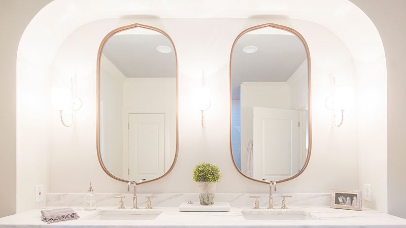
Kristen decided it wasn’t important to them to have a large master bedroom. “It’s just big enough,” Kristen says. “It’s small, but we love it.” What she was insistent about, however, was having natural light in the master bathroom shower, so they installed a solar tube in the ceiling, a pipe-like tube that delivers daylight inside enclosed spaces, to shine light on the marble-filled room.
 Girl’s Room
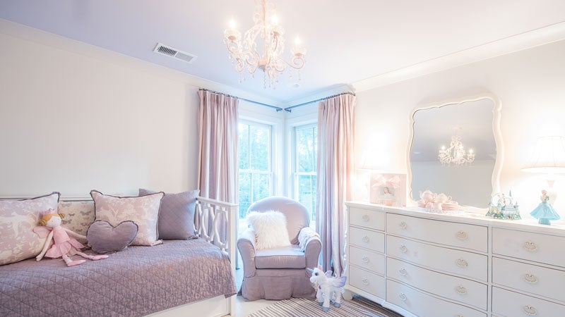
To give Embry the purple room she wanted, Kristen used lavender bedding, and they painted her ceiling a similar hue. As the only girl, her bathroom features a corresponding sophisticated lavender and silver wallpaper that can grow into her teen years with her. Kristen’s mom picked out the Pottery Barn light feature that plays to the princess side of Embry’s tomboy-princess co-persona.
 Boys Rooms and Bathroom
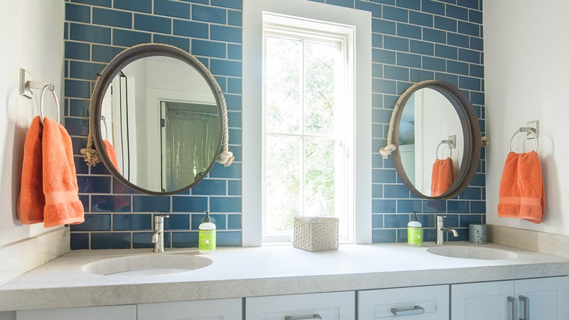
A map hangs above Jackson’s desk and he also has a light-up globe since he likes geography and traveling to new states. Next door sports fanatic Walker, age 4, has a look to match what he likes. Both boys rooms feature a stainless steel fan to keep things cool. A Jack and Jill bathroom with navy subway tile and nautical mirrors connects their rooms.
Behind the Scenes
- Home Designer: David Smelcer
- Contractor: William and David Seigel, Twin Construction
- Interior Design: Laurie Fulkerson, Twin Interiors
- Cabinetry: Lauren Brown, Twin Cabinets
- Countertops: Surface One of Birmingham
- Cabinet Hardware: Brandino Brass
- Custom Coffee Cabinet: Randy Burnham, Burnham’s Fine Cabinetry
- Plumbing & Appliances: Ferguson
- Tile: Triton Stone Group
- Lighting: Twin Interiors & Restoration Hardware
- Select Furnishings: Lee Industries, Alabama Furniture Market, At Home, Richard Tubb Interiors

