Gigi Whaley was no stranger to the grey Tudor home on the corner of Kensington and Wellington roads. Growing up on Saulter Road, she babysat for a family who lived in the house and had a friend who lived across the street. College, medical school and a child later, she walked in again with her husband, Mitchell, and was struck by the vaulted ceilings in the living room and the acre-plus lot. This was what they’d be looking for. And soon it was theirs.
Their intention from the beginning was to renovate the 1929 home, and so a year after adopting their second child, Kai, from China, the family moved out temporarily and the process began.
The principle name of the game was updating the space with new bathrooms and a new kitchen while maintaining its architectural integrity—a task not taken lightly by designer Richard Long. The Whaleys worked with him to replace wooded spaces in the house’s signature turrets with leaded glass that appears original to the house. Gigi and Mitchell are quick to note Richard’s talent for not just beautiful design but also practical design that helped them carve out space for a pantry and mudroom, along with many other details that now make their life easier.
Another important aspect of the design came from Gigi’s roots too. Her father had passed away in 2016, and her mom’s house had a large yard and had a lot of stairs. All signs seemed to point to creating a mother-in-law suite for her. Richard helped them plot out a separate area from the main house connected by an enclosed breezeway that gives Gigi’s mom a bedroom, bathroom, living area and kitchenette of her own, and their kids a play room above it. After her mom moved in, they were also able to incorporate some of her furnishings into the rest of the house.
Today all five family members have moved back in and are enjoying the new life breathed into the historic Tudor. Gigi in particular favors the light fixtures that accent the ceilings of each room, as well as the house’s new kitchen and den area. It’s spacious and cozy—just like the familiar vaulted living area just a few rooms over that first sold them on the house.
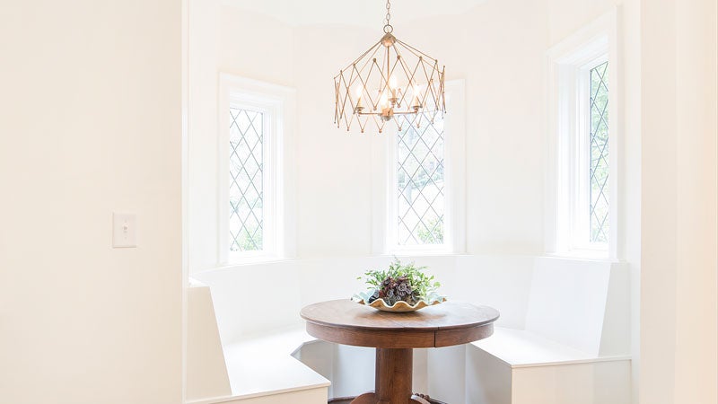
Breakfast Nook
Designer Richard Long had idea to create a custom banquet for this space off the kitchen, which was previously an entryway they never used. They had it designed to fit around Gigi’s grandmother’s table too.
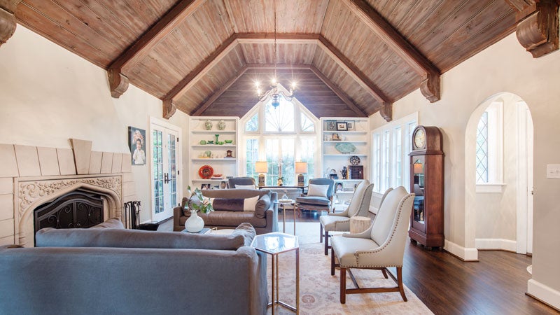 Living Room
It was this room that sold the Whaley’s on buying their house, and most of it remained the same when they did the renovations. To freshen up the look, they reworked the built-in bookshelves to be adjustable heights and styled them with the help of friends. Alongside two chair and a halves from Restoration Hardware, they also reupholstered two sets of chairs from Gigi’s mom’s house, all in shades of blue-greys.
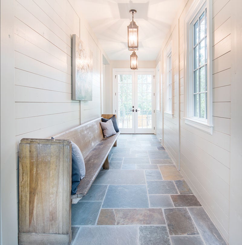 Connector
This blue stone-lined enclosed breezeway of sorts connects the main part of the house to a mother-in-law suite with a playroom above it. Replete with an old pew from Trinity United Methodist, where the Whaleys are involved, it’s easily become one of Gigi’s favorite spots in the house.
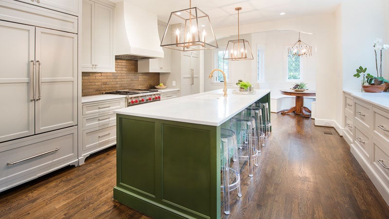 Kitchen
Gigi was drawn to images she had seen of a dark island with lighter cabinets surrounding it and went with a punch of green (Sherwin Williams Secret Garden) on the island and a grey for all the other cabinets that echoes the house’s exterior color. She had also wanted a copper backsplash, so Jonathan Lambert at Triton helped her select a Japanese tile with a similar look that would be lower maintenance. On either side of the range, Alabama marble countertops and backsplash is a large cabinet space. One of paneling covers their refrigerator and the other an appliance cabinet.
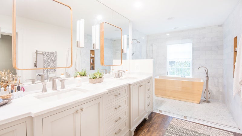 Master Bathroom
The master bathroom was tight on space, so designer Richard Long came up with the idea to put the tub—a wooden Japanese soaking tub to be specific—in the shower.
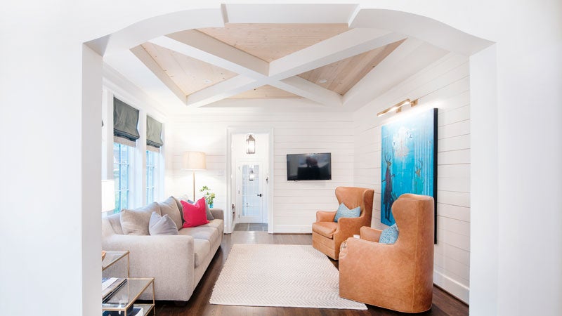 Sitting Area
Behind two camel leather chairs, a gift from Gigi’s mom, hangs a piece of art that connects the Seattle chapter of the Whaleys’ life to their Birmingham one. Gigi discovered Brian McGuffy’s work at Magic City Art Connection and quickly saw not only how she connected with his style but also that he resides in area code 206 (Seattle) but grew up in 205. Also of note, the ceiling of this space off the kitchen boasts wooden slats in the drop ceiling.
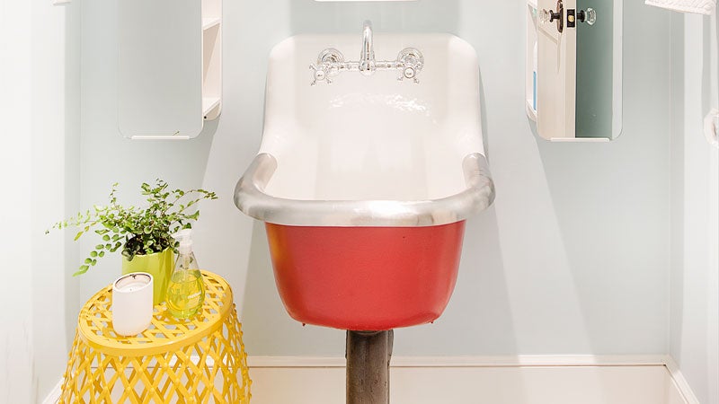 Girl’s Bathroom
Gigi had seen reclaimed sinks she liked on Etsy and created the look herself for a lower price point by painting the base of a new laundry sink red. Mirrors from Ikea hang above it.
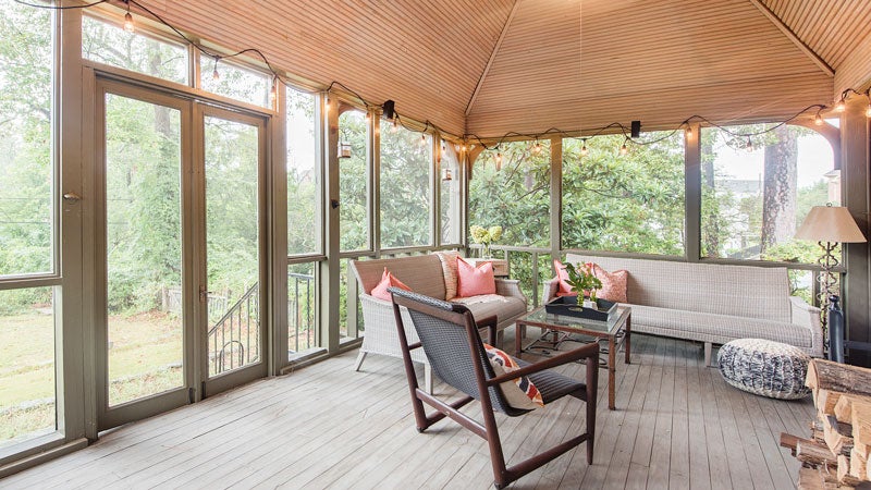 Screened-In Porch
This spacious living area was added on by previous owners, but Gigi added wicker from Summer Classics that would both be comfortable and easy to hose down when it got dirty. Alabama does have potent pollen season, after all.
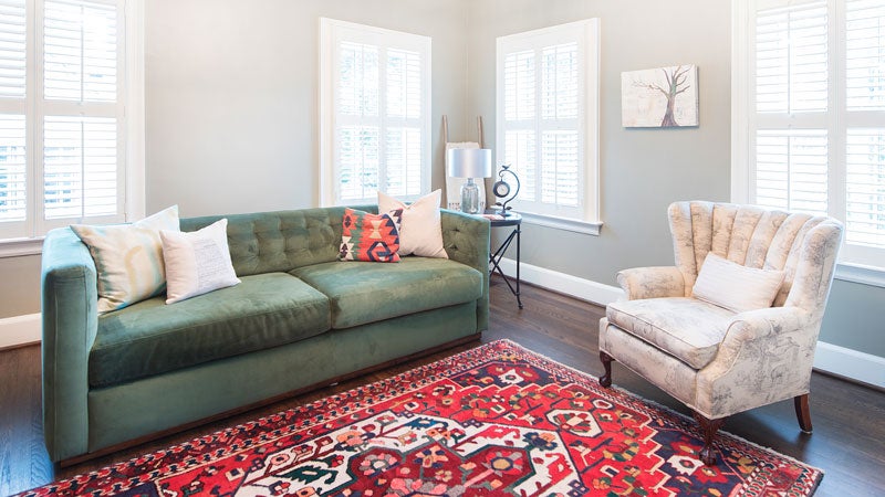 Den
Den
Before renovations, this downstairs room was a kids’ bedroom, but now that the kids have moved their rooms upstairs, it serves as both a den and an extra bedroom. A dark green West Elm couch with a bed hidden within is accented with an Alabama pillow from Alabama Goods that was a gift from a neighbor.
Behind the Scenes
- Designer: Richard Long, Long & Long Design
- Construction: Trey Goldstein, Cotton Construction Inc.
- Interior Design: Mary Louise Grogan, MLG Interiors
- Lighting & Plumbing Fixtures: Ferguson
- Tile: Jonathan Lambert, Triton Stone Group
- Countertops: CR Stone
- Cabinet Hardware: Brandino Brass
- Trim: Sean Adams, 4 Mile Wood Design
- French Doors & Custom Shelves: Bobby Adams, Red Mountain Building, LLC
- Custom Windows: Charles Atkins
- Landscaping: Curb Appeal

